


Today I'm thinking through my color palette. The downstairs is really one big room with porches and a master suite tacked on. So everything needs to FLOW in terms of colors
I'm down to two palettes.
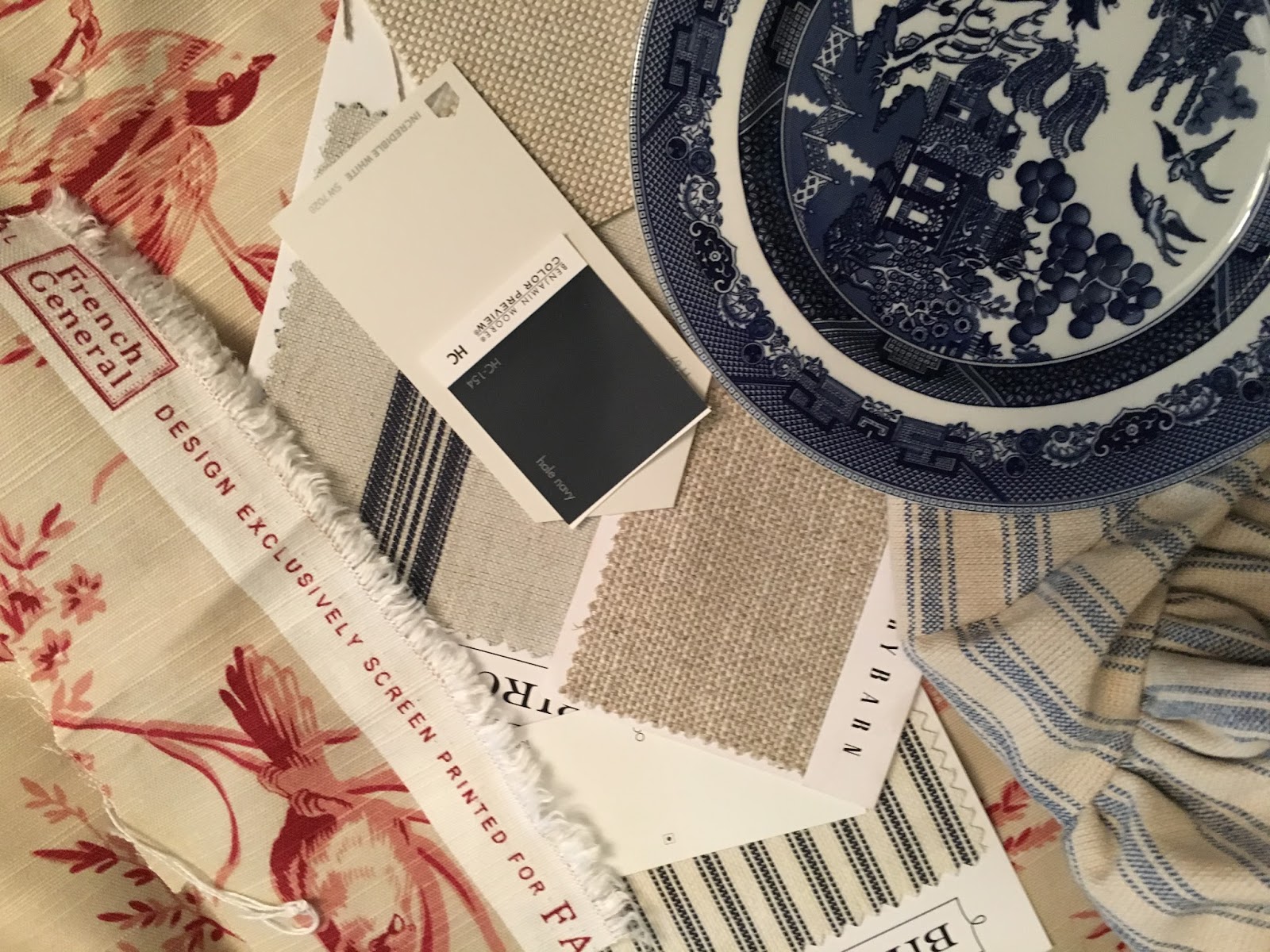
This one is mostly neutral with a pop of robin's egg blue.

As you can see there are a lot of neutral fabrics. These will be on the major pieces like sofa, chairs, drapery.

I think I would use the buffalo check and other prints on pillows, sink skirt and the like.

It is really pretty and a major contender.

Ok. What do you think of this selection?.
Again, the major pieces would be neutral although I probably would do a chair or two in a stripe and possibly a blue denim on another piece.

I really like the French General red bird toile.

The advantage with this color palette is that is really does look awesome with my blue and white.I know I can use it with the other color palette but I just don't like it as much.
Decisions. Decisions.That's when I consult the good book. No not THAT good book. This one.

This is an old Mary Engelbreit home owners' journal that I have made into my personal dream home scrapbook. Over the last several years I have crammed this poor thing with every photo, magazine clipping or floorpan that ever made my heart sing.Have a look.


This little book really tells the tale. It helps me to remain true to my personal style, the things that bring me joy. It helps to bring clarity to my mess. Tell me. Do you have a design Bible?
Is it Thursday already? That means I'm hanging with my friends at TOHOT!


22 comments:
Lisa, when we built our last house I had a book just like yours. It's magic! Those torn pages are better than any Pinterest board. If you love a page for years then you know that it's part of you. You know what I mean? I love everything you've show. You can definitely go neutral and incorporate the reds and blues. I can't wait to see! Just keep on sharing girl!
Happy TOHOT. Let's meet for lunch asap. :)
LOVE IT ALL!!! Here's my two cents. Keep all of your major investments ~ furniture, custom draperies, etc. in a neutral palette. Then use pops of color in small doses and accent pieces ~ small stools, pillows, vases, books. With your color selections I definitely see one that would work beautifully for spring and summer and the other for fall and winter.
lovely
These are such pretty inspiration boards! I am a fan of starting neutral and then you can go with whatever colors you want to add. My design bible is probably Pinterest...when I look through my pins, my style really is apparent to me!
Thanks so much for stopping by and for your kind comment...following now on Bloglovin'!
Love these boards and I love the inspiration, the combinations are so pretty! Have a lovely day
Beautiful boards and I really like the idea of the scrapbook. Talk about dreaming! Have a great day!
What great schemes and color selections. I really like the first one the best. The other one is too much color for me.
If I hadn't just finished my kitchen renovation I would borrow your scrapbook of beautiful ideas! I love neutrals and that's what I've done in my kitchen and working on it throughout the house. I want my patterns to come in china, pillows and any and everything that's easily changed out. I love your neutrals….
Lisa, I genuinely like your neutral fabric choices. I spy several PB swatches, too, and those little stool covers - MMS, right? I got a few myself, and love those! Like you, though, I also love toile, and that pop of red would probably need to show up somewhere in my decor to satisfy that craving. I love the bird print of the toile itself.Before Pinterest, I also kept a notebook of tear out sheets. Now I would need to combine both sources to review my so-called scrapbook. But if I were choosing new home decor, I would most definitely be pouring over them the same as you are doing. It's hard! I went back over a few home posts, and I love your plans for the BR and your plans to make new look old with things like doors. Count me as a new follower on this journey with you!
Rita C at Panoply
I love your choices in fabrics....but I think I like the first one the best. Love the robin's egg blue. A couple years ago I would have chosen the red toile. I can't keep up with my changes in taste but your neutral palette opens up a lot of different changes if you want them!
I love every image in your book, my darling Lisa, it's so very inspiring and suggestive and the fabrics you're going to choose are all so wonderful, I couldn't be able to decide !
Thank you for sharing such an amazing post, my loving friend,
enjoy the remainder of your week,
sending love to you
Dany
Both of your choices are just beautiful. If it was me, I would go with the first. But it is not me. It is you. Choose what YOU love. I used to collect magazine photos before Pinterest. I never put them in a pretty book though. You are so creative!
I have a file folder with magazine pages, etc, that I've saved over the years. If I like it, I put it in the folder. It doesn't have to make sense...just be something that pleased my eye. Enjoy!
Oh Lisa, I'm in love with both, but I think that if you went with the first choice, you could always add the other colors and fabrics that you love. The red and blues could be brought into the first choice. I do adore those red and blue fabrics that you picked. When I changed out my living room, I went with the neutrals and I really do love it. It's such fun to go on this journey with you.
Now I'm being fickle, because I just went back and looked again, and I like the second one because of the fabrics and with your blue dishes. It's so striking! Do what makes your heart happy! ❤️
Hi Lisa,
Thank you so much for visiting my blog and leaving such a sweet comment! It's so nice to meet you! :)
I love all of your choices but I especially love the Navy Blue and I have been in love with Hale Navy every since I saw it in a Pottery Barn!
Loved seeing your Home Journal too, all pretty pictures!
Happy Almost Friday! :)
Kimberley
Lisa, the most important thing is to do what makes your heart sing! I am a retired decorator and I always told my clients not to jump on the latest trends because they will change! I am a huge fan of toile, but I love both of your boards! Blessings, Pam @ Everyday Living
Lisa- it is all going to be stunning.
You are putting together a beautiful palette with the perfect touches of color.
You go girl!
Thank you for supporting TOHOT!
Oh! It's getting so exciting! I love it all. :)
So PRETTY!
~Liz
Lisa,
Love all of it!! So pretty! Thanks so much for the party!!
Hugs,
Debbie
lovely choices of colors and fabrics.. look forward to seeing how it turns out.
Post a Comment